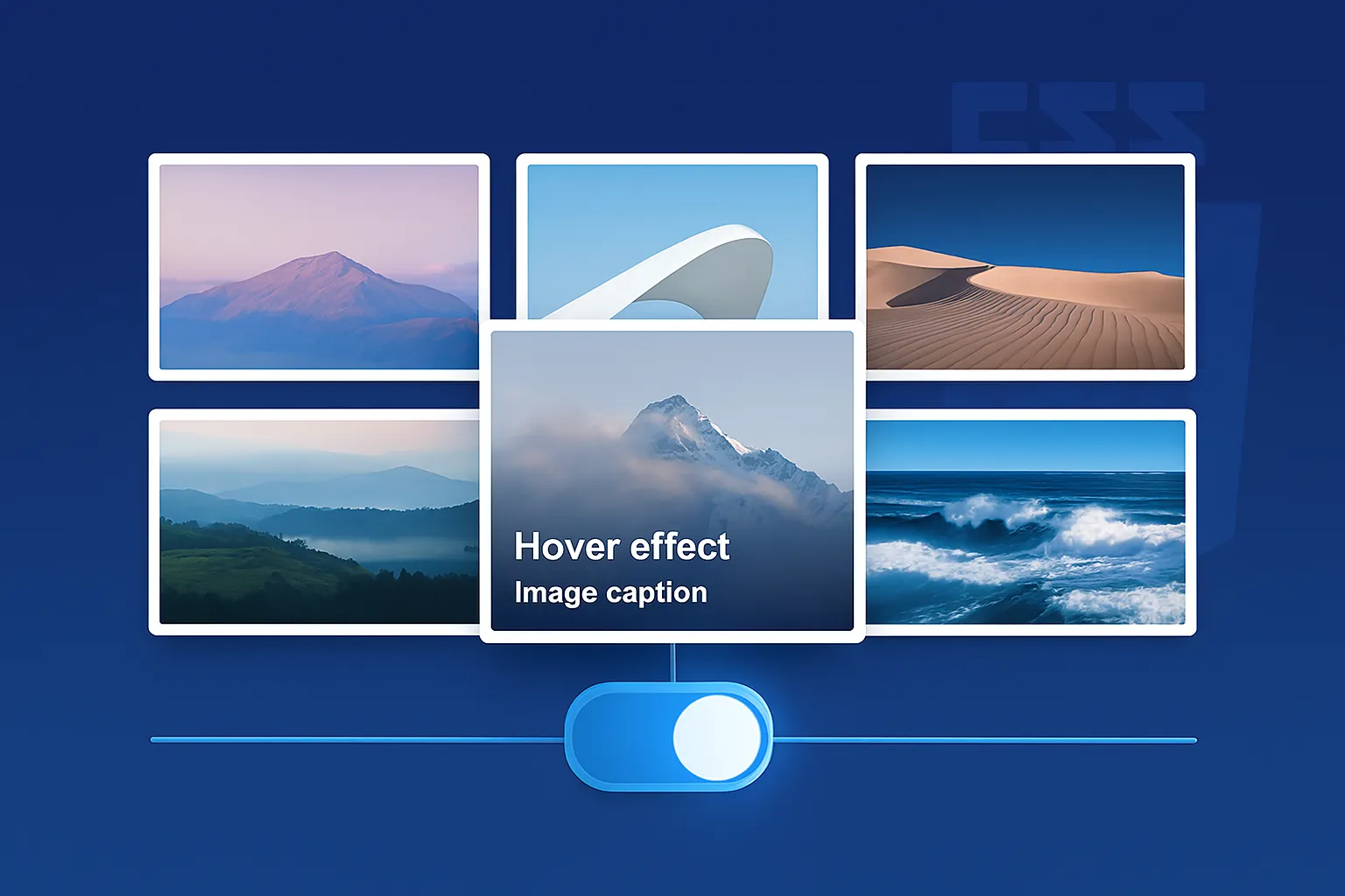
Showcase your images in style with this beautiful, lightweight, and fully responsive image gallery. The best part? It's built with 100% pure CSS for the layout and hover effects, meaning it requires absolutely no JavaScript. This makes it incredibly fast, lightweight, and easy to integrate into any project.
When a user hovers over an image, a smooth overlay appears along with a caption, providing a professional and interactive feel without slowing down your site.
Features:
- Fully Responsive Grid: The gallery automatically adjusts from 3 columns on desktop to 2 on tablets and 1 on mobile devices.
- Modern Hover Effect: A sleek, semi-transparent overlay and caption appear on hover, complete with a subtle zoom effect.
- Pure CSS: No JavaScript required! This ensures maximum performance and compatibility.
- Extremely Lightweight: Just a small CSS file is all you need.
- Easy to Use & Customize: Simply add your images to the HTML structure. Colors and effects can be easily modified in the CSS file.
How to Use:
- Add the HTML: Copy the HTML code inside the
<div class="gallery-grid">from theindex.htmlfile and place it on your webpage. - Add Your Images: Change the
<img src="...">paths to your own images and update the text in the<figcaption>for each one. - Link the CSS: Add the link to the
style.cssfile inside the<head>of your website.